Movie
posters are an integral part of a film’s promotional campaign even though; it
might not necessarily translate to sales or quality of production. I know we
have fallen victim to not judging a book by its cover and gone ahead to purchase
a movie with the hopes that by God it would be interesting, but in the course of running this blog, I have come across movie posters or should I
say film jackets and thought out loud, do film producers really take themselves
seriously? As in, ‘they are supposed to be a creative engine what’s with all
this half-baked non-creative jackets that annoy one rather than encourage us to
grab a copy’.
Knowing
that we produce our movies a dime a dozen, I couldn't go through all the movie
posters, so i present to you the best and the worst posters of 2014.

30 Days in Atlanta – While the movie may have hit the box office for 2014, this poster was just something else. Where do I start from, the New York background when it was meant for Atlanta, the look on AY’s face like he was about to take a shit or Ramsey Nouah’s hairy chest. Also that urge to showcase everyone in the movie on the cover is truly getting old, but hey, they managed to make it neat and as such this poster was sort of in-between for me.

Finding
Mercy – One of the many posters or like I mentioned jacket covers (I think this
was a poster sha!), talk about photo-shop looking funny. Another poster that
has all the acts on the cover, but asides having all of them on the cover, it
was done badly. So it feels the cover creator said Rita bring your picture,
then Blossom, Uti, Chioma and then he cropped them and just super-imposed them
on each other. As if that wasn’t bad enough, he adds the picture of a home in the
bush to probably spice it up bah! This was one of the worst poster for me, but the
movie was okay and earned Desmond Elliot a ‘Best Supporting Actor’ win, so I
guess we shouldn't judge a poster by its design right?

Forgetting
June – Another super-imposition gone wrong. Would it have killed this artist to
show one of the acts at a distance looking lost and forgotten but hey it’s got
to be easy if we just call for pictures and piece them together on the
poster. While I have come across a number like this, did they really have to
use Mbong Amata’s face to block Majid’s? Another horrible poster if you ask me.

Secret
Room – I was kind of drawn to this movie, not sure if it was the poster or the
jacket, but now that I look at it, I wonder why. It was good movie don’t get me
wrong, but this poster was all sorts of wrong. What’s with the oily water look
on OC and while you can see the fear in Lilian’s look, was having Jide Kosoko
in the poster a real necessity? This poster wasn’t horrible, wasn’t great as
well, it can be better is where I will place it.


When
Love Happens – The 2014 RomCom of the year, was pretty unexpected and a true
breath of fresh air, the poster, not so much. While it was different from the normal or was
it, there was nothing really lovevy dovey or comedic about this poster, but it
does get a nod on my impressive list.

Knocking
on Heavens Door – Nothing speaks volumes like a poster that has the leads in
full blow frontal and then other characters smaller. Now while I believe, this
wasn’t too shabby, as one can’t really tell what the plot of the movie was
about, I just don’t get why the house and the bridge was place in the poster
anyway, is that the way to Heaven?

Half
of a Yellow Sun – With several posters to boast of, what I felt for this poster
was way better than what I felt for the actual movie. It was an impressive
poster, the characters had a glimmer of hope in their eyes
like it wasn't the end of the world and maybe the movie kind of portrayed that
as well.

One Night in Vegas – While it was a horrible production, it wasn't a bad poster. It was 4 characters above and Las Vegas below, at least this time, it was the correct city in the picture


October 1 – While this physiological thriller earned a whopping 9/10 from Xplore, the poster was erm…. nothing fantastic. Having your characters super-imposed on one corner and then a church and a bell on the other side tells us all we need to know actually (even though it’s after you watch the movie it will add up). But can you imagine a black poster with just the national flag on a pole illuminated?

Dazzling Mirage – All kind of wonderful is what I can say about this poster. I would have loved to remove all the characters on the side though, but it had the creative balance that was appealing, the use of light and color gave it a balanced, don’t get the image far off, but it was an impressive poster for me
I stumbled on these movie posters on instagram, all produced and staring Uche Jumbo.
A Long Night, Oge’s Sister and Almost Perfect
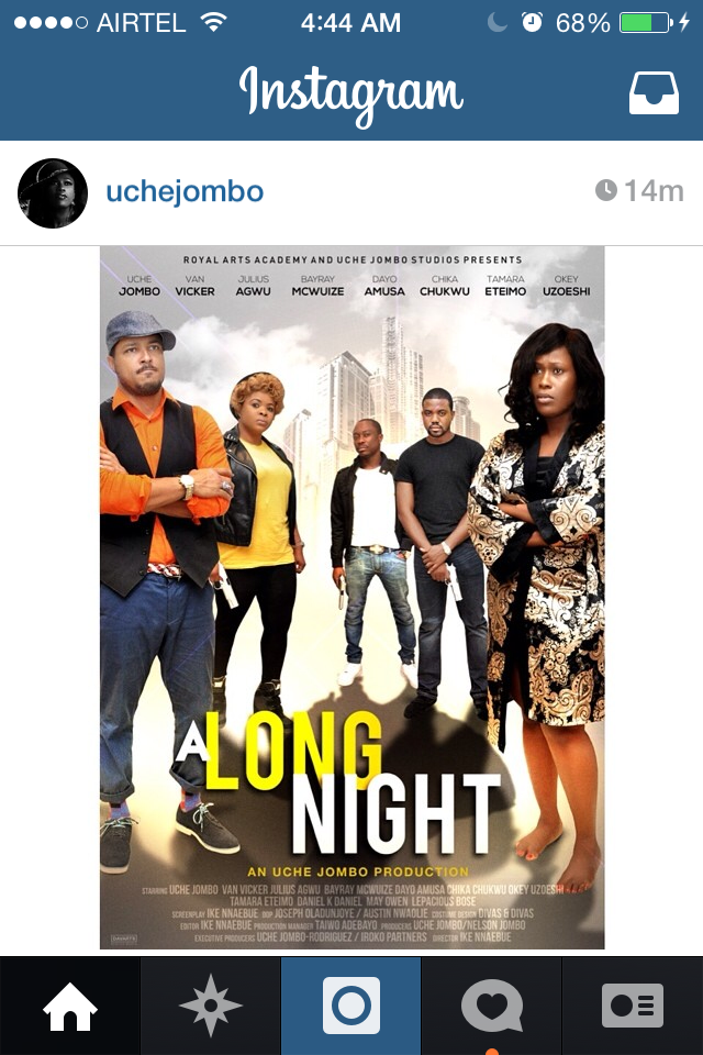


Facial expressions look similar right? If i missed any poster send me a link or let me what you think in the comments section.
No comments:
Post a Comment